It’s my favorite time, when the new shipment of home design magazines. Every magazine this month features blue. As my readers know I have an affinity for blue – turquoise, cerulean, indigo, navy, robin’s egg and the lists goes on.
Horchow mail order catalogue has a four page spread in Traditional Home this month featuring blue and white, mainly a crisp navy and white interiors, but the last page of the ad features a mainly white interior with art accents of a water blue with warm golden honey wood tones. Blue and white is a mainstay for any room, any design style and any budget. I also think Asian design, especially Japanese and Chinese pottery and wood pieces work with any style. The key to a successful room design is scale, proportion and balance.
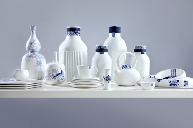
Blue is ingrained in every culture. We see it woven into beautiful textiles of India and Middle East, the delicate porcelians of Japan and Chinese cultures, as well as the textiles and pottery of the Mediterranean cultures. As I am writing this I think my next blog topic will be more in depth writing of usage of blue in various colors. Back to our previous subject the Blue and white interiors in this month’s home design magazine.
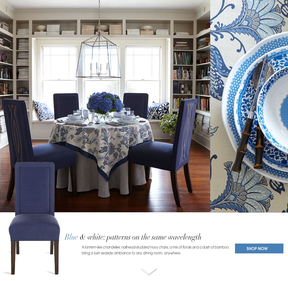
The chairs in this photo are beautiful. I love the warm brass nailhead detail. Nailhead is great way to dress up an solid upholstery piece. The room is doesn’t look staid because the dishes and the linens have lots of pattern and movement. the warm orangish wood floor grounds the room.
This image and the one above are from the Horchow Collection named Coast Modern. The ad features my favorite colors blue and white, but as you see vivid green tropical plants add a bunch of color. It is okay to mix woods. This room has a warm light wood coffee table and the chairs have a dark wood frame. It works because of the contrast. Notice the contrast of primitive pattern indigo and white throw pillows in formal setting.

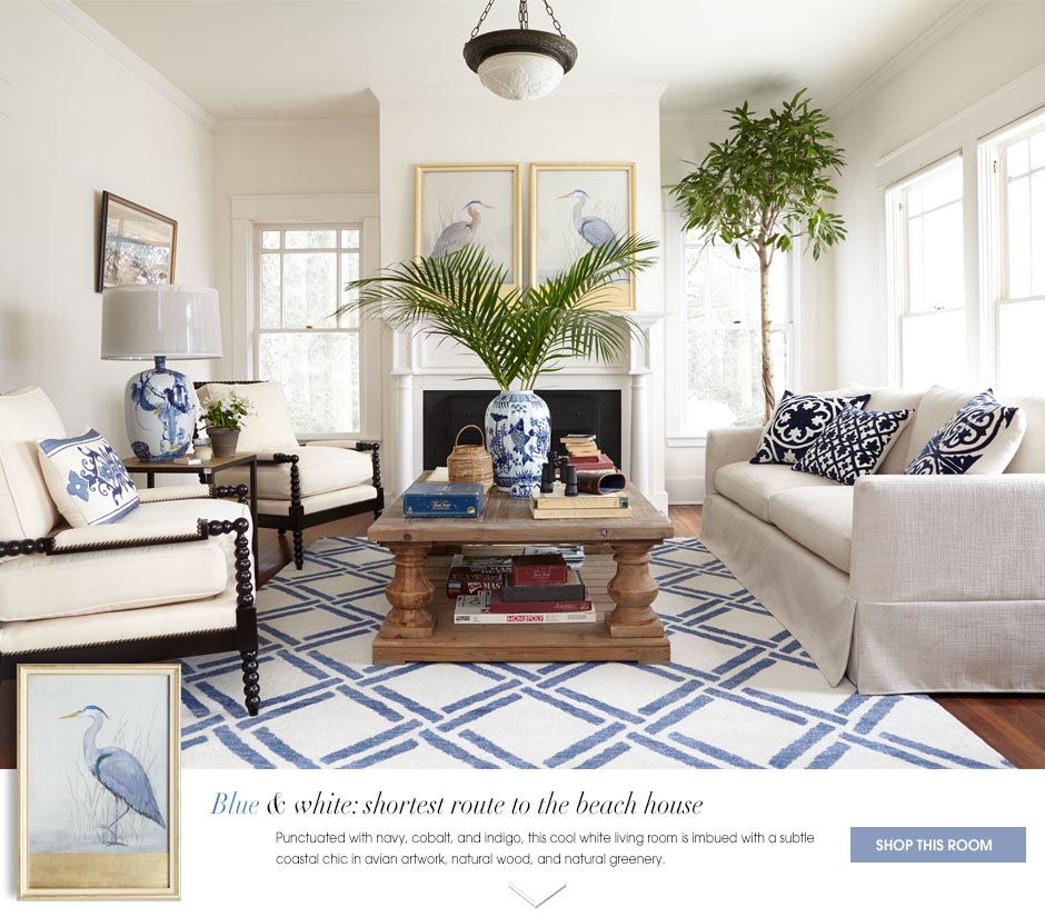
I love the simplicity of this room. Blue and white being the mainstay with honey toned accent in the wicker and flooring. The design element pattern, makes this room interesting. It uses stripes, greek keys, scrolls, circles and squares.
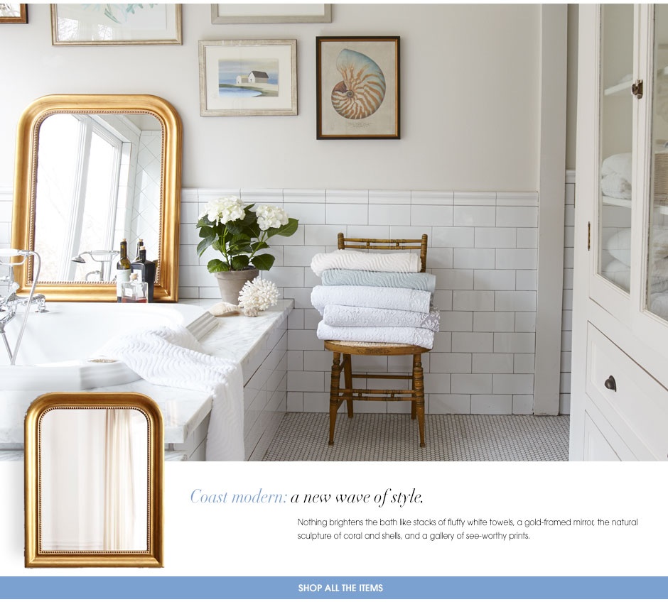
I love this room! Blue and white doesn’t have to be bold like the previous photos. It is simply used in the beautiful watercolors artwork accented with the watm tones of the gold mirror and soft orange of the shell.