Design with Heart

As I have mentioned before I love the beginning of the month when the latest issue of my home magazines arrive. The latest Pantone color Marsala, which has gotten flack, but I love it. Marsala is wine color with a hint of gray. That will be another blog posting.

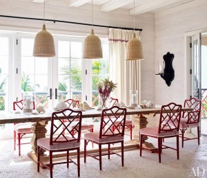
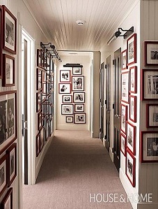
This month the stand out for me is the editor’s page of Architectural Digest. Margaret Russell states “buy what you love.” YES, thank you Margaret. The most memorable homes are the ones that reflect the homeowners life, memories and inividuality. It’s okay to mix it up, modern and traditional, brass and silver, creams and grays, new and old. Ignore the trends and buy what you love. That is my design philosophy. I have a client that has a great style an loves to mix it up. That is makes designing a home fun and exciting, but also creates a unique home.

I recently read an article in the New York Times about the auction of Bunny Mellon’s estate. The writer was stating many of the furnishing were out of fashion. I have a previous posting about Bunny Mellon’s classic style. Her home was beautiful and elegant.

This year I will be encouraging my clients to really think about what they love and go for it.

Have a blessed and Happy New year!!
 

Let the Sun shine!

Since attending the workshop on branding and color imaging I have applying the theories to interiors. I love color so the philosophy of color adds another level. I have so many clients ask about what is trending in color. Color is a personal choice, just like your interiors. It’s not about what is the hottest trend it’s about how the hottest trend fits into your home or office. Just because a warm gray is the newest trend for wall color it may not be right for your home. One size does not fit all.

The color I have been thinking about today is yellow. I love yellow. It’s warm, friendly and can be uplifting.  I live in Texas so we have 352 days of sunshine. However I have yellow walls in my kitchen and it drives me crazy. They came with the house.

image


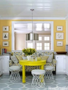
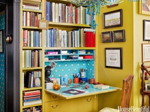
Yellow is the first color the eye sees. Yellow and gray are a favorite color combination. Gray provides the neutral to the intense yellow of this room. I love the bright golden yellow on the walls in contrast to the acid yellow lacquer on the table.

image


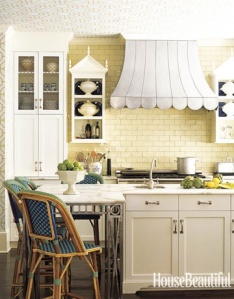
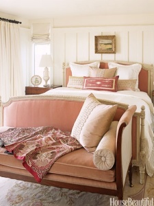
I love this softness of this kitchen. The soft creamy yellow of the tile and cabinets, accented with blue and white. This is a classic use of yellow, blue and white. Yellow increases concentration.

image


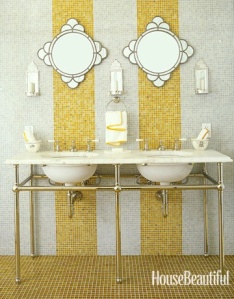
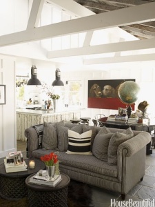
Yellow represents happiness and high energy. I think I would be happy if I had this bathroom. Sophisticated and playful.

image


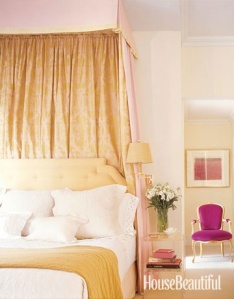
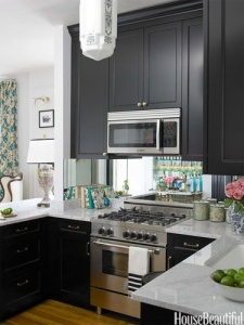
How cool is this color combo? Soft lemony yellow accented with a vivid magenta. Yellow is exciting and magenta, which is part of the pink family brings a joyful and youthful edge to a traditional design.

Color can transform amy interior whether – traditional, modern, french country, formal or casual.

Do not use yellow if you are feeling nervous or don’t want to be noticed.

My Blue Obsession

I recently was reading a stack of older magazines and I noticed a cover of House Beautiful 2010 featured the color blue. The entire magazine is dedicated to various shades of blue – indigo, navy, robin’s egg, green blue etc. I was surprised the blue decorating trend is celebrating fourth year of popularity. I can’t really think of anything or anyone that has universal appeal, okay maybe the Royal family.

So I have been wondering about this trend for some a while. Believe it or not, I do have other things to think about, besides the color blue.  Trend of blue fascinates me, or the longevity of the trend. While I was at a lunch event on branding. The presenter, Catherine Hatcher, President of Personas Image Dynamics, demonstrated the power of color in presentations, brands etc.  and how the color you wear to meeting can influence the tone. The color blue in the only color the has world wide appeal, 85% of people like the color blue.

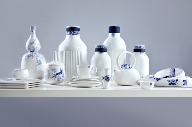
This is why the color blue is a mainstay in interiors and continues to be a color focus.  Blue is like a good friend, comforting, appealing easy to be around.

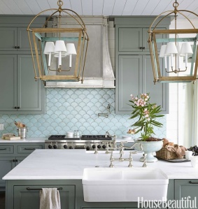
Here is a close up of the tile and the light fixtures. the inside of the light fixture is painted blue.

Here is a close up of the tile and the light fixtures. the inside of the light fixture is painted blue.

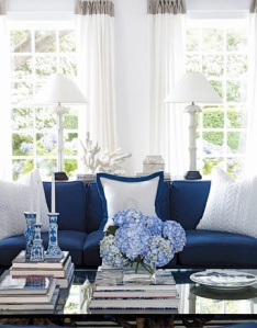
The color navy blue conveys trust, responsibility, credibility and truthfulness.  White signals refinement and purity. White is also the color of genuineness, innocence and youthfulness.

The color navy blue conveys trust, responsibility, credibility and truthfulness.
White signals refinement and purity. White is also the color of genuineness, innocence and youthfulness.


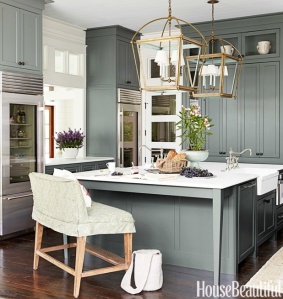
I think this one of the most beautiful kitchens published. Look closely and many shades of blue appear. the cabinets a blue gray, back splash tile a subtle blue-green and the it of brass make it shimmer.  Blue green mixtures have different meanings. A blue with more green like aqua conveys prestige, high ideals and attracts attention.  Turquoise, which has more blue than green suggests high powered and youthfulness.

I think this one of the most beautiful kitchens published. Look closely and many shades of blue appear. the cabinets a blue gray, back splash tile a subtle blue-green and the it of brass make it shimmer. Blue green mixtures have different meanings. A blue with more green like aqua conveys prestige, high ideals and attracts attention. Turquoise, which has more blue than green suggests high powered and youthfulness.


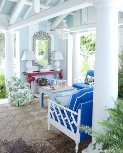
A bright true blue signifies sincerity and truth, also friendly and approachable. This room mixes a playful palm pattern. I love palm patterned fabric and wallcoverings. The color green adds a pleasant and refreshing element.  The color green denotes peacefulness, balance friendly and candid. A dark green implies wealth and tradition. The pop of red adds energy to the space. Red is passionate, angry, provocative and  memorable.

A bright true blue signifies sincerity and truth, also friendly and approachable. This room mixes a playful palm pattern. I love palm patterned fabric and wallcoverings. The color green adds a pleasant and refreshing element. The color green denotes peacefulness, balance friendly and candid. A dark green implies wealth and tradition. The pop of red adds energy to the space. Red is passionate, angry, provocative and memorable.


The images are from House Beautiful’s website and the color descriptions are from Catherine Hatcher’s color guide.


Behind the Photo Shoot!

I love this post from one of my favorite bloggers, Julia from Hooked on Houses. She is my design kindred spirit. I have to reblog her latest posting on home that was featured in Better Homes and Gardens. Magazine readers haven’t clue how long and what it takes to do a photo shoot. I shoot can take hours to set up, but before the shoot you have to shop for accessories, furniture and fresh flowers. I love photo shoots but they are time consuming, but very fun.

You can find the article at:

http://www.hookedonhouses.net/2014/08/25/styling-a-colorful-ranch-for-better-homes-gardens

I hope this link works, I am technologically challenged at times.


Pillow Talk

Okay, I am obsessed with old romantic comedies from the 1960’s, mainly Doris Day’s movies. Doris Day epitomizes glamour and classical style. The interior design and clothing design for her movies are timeless. The movies and TV shows I watched as a kid have shaped my interior design love and style.

Doris Day 1960’s romantic comedy movies are my version of a Dylan’s Candy Bar, the candy store in New York City. I love them – they are colorful, uplifting and visually stimulating. if watch to many of them you will get a sugar hangover. It is worth the indulgence, of course in moderation.

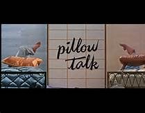
Pillow Talk is one of my favorite movies. Love  Doris' apartment.

Pillow Talk is one of my favorite movies. Love Doris’ apartment. The movie is about Doris Day and Rock Hudson sharing a telephone line called a party line. Arguments arise when Rock Hudson hogs the party line to woo his girl friends.

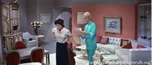
In this scene Doris is talking with her housekeeper in the living room. I would wear her pajamas. love the pink walls and  white furniture. I envisioned my grown up apartment to look like this, but as you know I love blue and white.

In this scene Doris is talking with her housekeeper in the living room. I would wear her pajamas. love the pink walls and white furniture. I envisioned my grown up apartment to look like this, but as you know I love blue and white. Doris and her maid Alma are discussing Rock Hudson conversations.

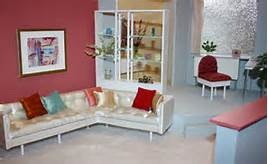
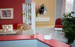
The two images above are the

The image above is a photo of the set, the image below is also a photo of the set.

image


Check out more movie homes at one of my favorite blogs hookedonhouses.net


Thinking Small

The August edition of House Beautiful arrived a while ago, I am behind on my reading. The cover story is about living in small spaces. Obviously I am not the only one thinking about living in reduced square footages. The articles prove you don’t have to give up style and function .

Customize - Bespoke built-ins, storage nooks, and furniture tailored to your exact needs can utilize every available sliver of space. Design by Brockschmidt & Coleman

Customize – Bespoke built-ins, storage nooks, and furniture tailored to your exact needs can utilize every available sliver of space.
Design by Brockschmidt & Coleman

Use bigger - fewer things. It may seem counterintuitive, but outfitting a small space with just a few large-scale pieces (rather than a mishmash of pint-size furniture) can actually make it feel grander. That said, don't be afraid of filling up the space. When a room is populated with furniture, it actually appears larger. Designed by Mona Hajj

Use bigger – fewer things.
It may seem counterintuitive, but outfitting a small space with just a few large-scale pieces (rather than a mishmash of pint-size furniture) can actually make it feel grander. That said, don’t be afraid of filling up the space. When a room is populated with furniture, it actually appears larger.
Designed by Mona Hajj


Choose furnishings and decorative elements that offer maximum functionality in minimal square footage. "Use two small round tables instead of one big coffee table," designer Ken Fulk says. "They're better for traffic flow than one of those huge knee knockers, and easier to move." Designed by Ken Fulk

Choose furnishings and decorative elements that offer maximum functionality in minimal square footage. “Use two small round tables instead of one big coffee table,” designer Ken Fulk says. “They’re better for traffic flow than one of those huge knee knockers, and easier to move.”
Designed by Ken Fulk


Think Vertically - Exploit the often under-utilized space between the tops of furniture and a room's ceiling with hanging or high-mounted elements. They'll draw the eye upward. Take bookcases and cabinets all the way up. Designed by Summer Thorton

Think Vertically – Exploit the often under-utilized space between the tops of furniture and a room’s ceiling with hanging or high-mounted elements. They’ll draw the eye upward. Take bookcases and cabinets all the way up.
Designed by Summer Thorton


The articles demonstrate how to live large in small spaces. Some where apartments and others where diminutive homes. I am posting some great ideas from House Beautiful’s website.

A DIY Project

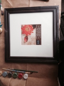
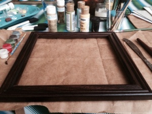
Here's the $2.49 frame before.

Here’s the $2.49 frame before.

I picked up Martha Stewart gold metallic paint and started by multiple layers of thin gold paint.

I picked up Martha Stewart gold metallic paint and started by multiple layers of thin gold paint.

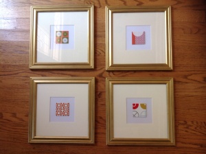
The final piece. The artwork is illustrations of fabric designs from Maharam.

The final piece. The artwork is illustrations of fabric designs from Maharam.

First I want to thank my followers. When I started this I didn’t think anyone would read my blog. So thanks again.

I really don’t have a lot of time for DIY, but I love doing creative projects for my home. Lately I have been determined to frame all the bit and pieces of art I have been collecting for many years. Our local frame shop is having their buy one frame get one for a penny sale.

However the frames I am highlighting in this blog are from Michaels. I picked these up for $2.49 each! I love a bargain and didn’t care about color, because paint can transform almost anything.

“What color is in Style?”

As an interior designer I am constantly asked by home owners “what is the color is in style?” My response, ” good design is always in style.” Shades of blue, reds, yellows, greens, white and black appear in almost every home at anytime in history. My point is a room that is well design can introduce the trending version of any color. The color can be added with throw pillows, a new carpet and accessories.

A great design keeps the major elements of a home neutral. Neutrals are not just cream, white and black. Grey, navy blue and even a red can be a neutral. Brown has been a neutral for many years and it can be updated with grey, cream and hint of pink or orange.

The photo images I have collected for today’s posting highlights red as the star. My inspiration is from my favorite designer Sarah Richardson. One of my goals is to have a friend and design buddy like Tommy Smythe, who is also an excellent designer.  They make our jobs look like fun. Some days it is some days not so much.  I found some of these images on her website which is great place for perusing interior design ideas.

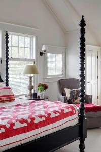
This is an excellent example of a neutral back drop with accents of red. Imagine this quilt could be yellow, pink or green.  The possibilities are endless, but i do love the red.

This is an excellent example of a neutral back drop with accents of red. Imagine this quilt could be yellow, pink or green. The possibilities are endless, but i do love the red.

Hints of red add a vibrancy and warmth to this room without being over powering.

Hints of red add a vibrancy and warmth to this room without being over powering.

How fun is this?

How fun is this?