I recently was reading a stack of older magazines and I noticed a cover of House Beautiful 2010 featured the color blue. The entire magazine is dedicated to various shades of blue – indigo, navy, robin’s egg, green blue etc. I was surprised the blue decorating trend is celebrating fourth year of popularity. I can’t really think of anything or anyone that has universal appeal, okay maybe the Royal family.
So I have been wondering about this trend for some a while. Believe it or not, I do have other things to think about, besides the color blue. Trend of blue fascinates me, or the longevity of the trend. While I was at a lunch event on branding. The presenter, Catherine Hatcher, President of Personas Image Dynamics, demonstrated the power of color in presentations, brands etc. and how the color you wear to meeting can influence the tone. The color blue in the only color the has world wide appeal, 85% of people like the color blue.
This is why the color blue is a mainstay in interiors and continues to be a color focus. Blue is like a good friend, comforting, appealing easy to be around.
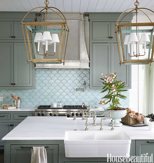
Here is a close up of the tile and the light fixtures. the inside of the light fixture is painted blue.

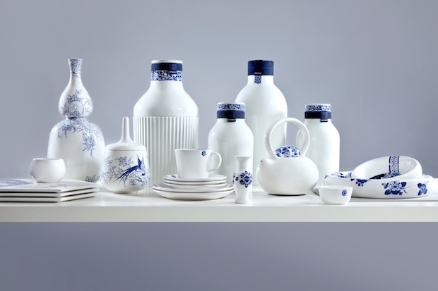
The color navy blue conveys trust, responsibility, credibility and truthfulness.
White signals refinement and purity. White is also the color of genuineness, innocence and youthfulness.
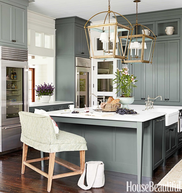
I think this one of the most beautiful kitchens published. Look closely and many shades of blue appear. the cabinets a blue gray, back splash tile a subtle blue-green and the it of brass make it shimmer. Blue green mixtures have different meanings. A blue with more green like aqua conveys prestige, high ideals and attracts attention. Turquoise, which has more blue than green suggests high powered and youthfulness.
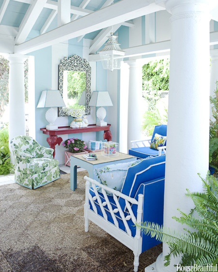
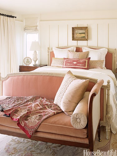
A bright true blue signifies sincerity and truth, also friendly and approachable. This room mixes a playful palm pattern. I love palm patterned fabric and wallcoverings. The color green adds a pleasant and refreshing element. The color green denotes peacefulness, balance friendly and candid. A dark green implies wealth and tradition. The pop of red adds energy to the space. Red is passionate, angry, provocative and memorable.
The images are from House Beautiful’s website and the color descriptions are from Catherine Hatcher’s color guide.