Design with Heart

As I have mentioned before I love the beginning of the month when the latest issue of my home magazines arrive. The latest Pantone color Marsala, which has gotten flack, but I love it. Marsala is wine color with a hint of gray. That will be another blog posting.

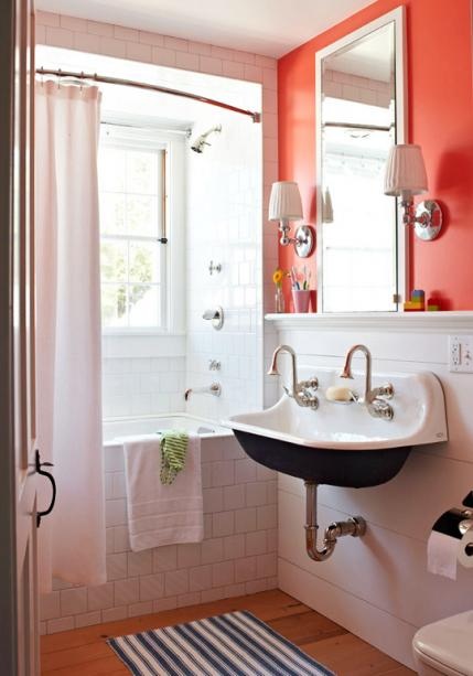
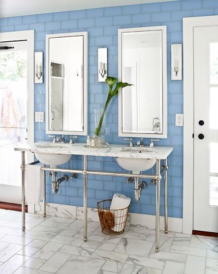
This month the stand out for me is the editor’s page of Architectural Digest. Margaret Russell states “buy what you love.” YES, thank you Margaret. The most memorable homes are the ones that reflect the homeowners life, memories and inividuality. It’s okay to mix it up, modern and traditional, brass and silver, creams and grays, new and old. Ignore the trends and buy what you love. That is my design philosophy. I have a client that has a great style an loves to mix it up. That is makes designing a home fun and exciting, but also creates a unique home.

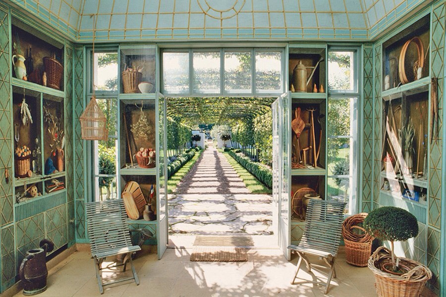
I recently read an article in the New York Times about the auction of Bunny Mellon’s estate. The writer was stating many of the furnishing were out of fashion. I have a previous posting about Bunny Mellon’s classic style. Her home was beautiful and elegant.

This year I will be encouraging my clients to really think about what they love and go for it.

Have a blessed and Happy New year!!


Classic Design?

Bunny Mellon - NYC Socialite and garden contributor.

Bunny Mellon, at Oak Spring Farms, her 4,000-acre estate in Upperville, Virginia, in the 1980s.
The heiress, who died on March 17th at age 103, was known for her design acumen. She gave so much attention to what she wore, how she lived, and what she planted; she even had her gardening apparel custom made by two favorite couturiers: Cristóbal Balenciaga and, after his death, Hubert de Givenchy.
Photo: Fred R. Conrad/The New York Times/Redux

Bunny Mellon’s bedroom at her 26-acre estate in Osterville, Massachusetts, which is now owned by businessman William I. Koch. The enameled-metal bed with a ruffled canopy was a model that she specified often for her homes; several were kept in storage for future use. Regional expressions were frequent in her interior decoration, including the seascapes, swan figure, and boat models shown here.

Bunny Mellon’s bedroom at her 26-acre estate in Osterville, Massachusetts, which is now owned by businessman William I. Koch. The enameled-metal bed with a ruffled canopy was a model that she specified often for her homes; several were kept in storage for future use. Regional expressions were frequent in her interior decoration, including the seascapes, swan figure, and boat models shown here.

The Oak Spring Garden Library at the Mellons’ Virginia stud farm was designed in 1980 by modernist architect Edward Larrabee Barnes to hold Bunny Mellon’s thousands of rare garden books and horticulture manuals. In this corner, a flowered rug is laid on the diamond-pattern painted floor, and a library ladder stands at the ready. The library is open to scholars by appointment.

The Oak Spring Garden Library at the Mellons’ Virginia stud farm was designed in 1980 by modernist architect Edward Larrabee Barnes to hold Bunny Mellon’s thousands of rare garden books and horticulture manuals. In this corner, a flowered rug is laid on the diamond-pattern painted floor, and a library ladder stands at the ready. The library is open to scholars by appointment.

French artist Fernand Renard painted trompe l’oeil scenes on the storage cabinets that line a room at the Mellons’ greenhouse complex in Virginia. One cabinet door includes an image of a ring hung on a ribbon. Once the door was opened, there was a hook with a ribbon, onto which Bunny Mellon safely threaded her wedding band before gardening.

French artist Fernand Renard painted trompe l’oeil scenes on the storage cabinets that line a room at the Mellons’ greenhouse complex in Virginia. One cabinet door includes an image of a ring hung on a ribbon. Once the door was opened, there was a hook with a ribbon, onto which Bunny Mellon safely threaded her wedding band before gardening.


I was flipping through Architectural Digest and came across this article about Bunny Mellon. Her fashion sense, gardens and interiors are always in style.  A classically tailored interior can always be fresh by updating the accessories and tweaking the paint color.  One of the reasons for starting this blog is discuss the idea of a “Collected Home”. A home reflects the lives of the homeowners. I think Bunny Mellon’s home reflects her style and life.

2 of 11 Paul Mellon’s study at the couple’s townhouse in New York City, decorated with the help of several interior designers, including John Fowler, Paul Leonard, Billy Baldwin, and Bruce Budd. Gilt-framed antique landscapes fill the walls, which have been painted a rich coral.

2 of 11
Paul Mellon’s study at the couple’s townhouse in New York City, decorated with the help of several interior designers, including John Fowler, Paul Leonard, Billy Baldwin, and Bruce Budd. Gilt-framed antique landscapes fill the walls, which have been painted a rich coral.


A classically designed interior transcends the trends. Trends can be applied to the interior but not dictate the feeling of the room. I have clients who are so concerned about what’s the style or color of the season. It doesn’t matter if the color of season is radiant orchid, if you are not of fan of radiant orchid just because it’s the color of the year you are not going to like it any better in 2014 than you did in 2013. However if you want to add it your home do it by adding the color in small doses – a few throw pillows, a glass vase or a real orchid.

Any hoo – here are a few images of Bunny Mellon’s home which was designed and furnished in the 1980’s which items from her previous home.  I hope you enjoy looking at these photos as much as me.


photo credit: Architectural Digest

“What color is in Style?”

As an interior designer I am constantly asked by home owners “what is the color is in style?” My response, ” good design is always in style.” Shades of blue, reds, yellows, greens, white and black appear in almost every home at anytime in history. My point is a room that is well design can introduce the trending version of any color. The color can be added with throw pillows, a new carpet and accessories.

A great design keeps the major elements of a home neutral. Neutrals are not just cream, white and black. Grey, navy blue and even a red can be a neutral. Brown has been a neutral for many years and it can be updated with grey, cream and hint of pink or orange.

The photo images I have collected for today’s posting highlights red as the star. My inspiration is from my favorite designer Sarah Richardson. One of my goals is to have a friend and design buddy like Tommy Smythe, who is also an excellent designer.  They make our jobs look like fun. Some days it is some days not so much.  I found some of these images on her website which is great place for perusing interior design ideas.

This is an excellent example of a neutral back drop with accents of red. Imagine this quilt could be yellow, pink or green.  The possibilities are endless, but i do love the red.

This is an excellent example of a neutral back drop with accents of red. Imagine this quilt could be yellow, pink or green. The possibilities are endless, but i do love the red.

Hints of red add a vibrancy and warmth to this room without being over powering.

Hints of red add a vibrancy and warmth to this room without being over powering.

How fun is this?

How fun is this?

Expanding Your Color Palette

This is my favorite time of the month because all of my new interior design magazines arrive. As you know I am collector and magazines is one of my favorite things to collect. I have stacks of them. I have them organized under tables and in bookcases. One of the reasons I started this blog to share beautiful spaces and to inspire others to create beautiful spaces. A well designed space doesn’t have to break the bank. I am working with a friend to furnish and update her living room and family room. I will post those when we are finished.

As I was browsing through the magazines, I love the colors, the lighting and new product information. Lamps is another passion, I have a entire closet filled with lamps and shades.

Here are a few of my favorite images this month.  I love the rooms because of the fun use color and paint. The owners strive for a relaxed family friendly space. This is an article from the Traditional Home Magazine website.

Cape Cod Summer House  written by Amy Elbert
Photography: Werner Straube
Produced by Stacy Kunstel

Architect: Reed A. Morrison, Reed Morrison Architect, 113 Pond St., Osterville, MA 02655; 508/428-8379, reedmorrisonarchitect.com. Interior designer: Maureen Footer, Maureen Footer Design, 30 E. 95th St., Suite 7C, New York, NY 10128; 212/207-3400, maureenfooterdesign.com.
Builder: C.H. Newton Builders, 919 Main St., Osterville, MA 02655; 508/428-5528.


Above the great room, children can play undisturbed in a lofted space with a green-stained ash floor from LV Wood Floors.

Above the great room, children can play undisturbed in a lofted space with a green-stained ash floor from LV Wood Floors.

Twin boys can wash together with dual faucets and a trough sink from Kohler.

Twin boys can wash together with dual faucets and a trough sink from Kohler.

Bleached wood walls and oculus windows on each end of the house keep the interior light. Shelves add height to the sitting area, furnished with Walters Wicker woven club chairs and an Avery Boardman sleeper sofa. Blue fabric on the seating is John Robshaw "Aleppo."

Bleached wood walls and oculus windows on each end of the house keep the interior light. Shelves add height to the sitting area, furnished with Walters Wicker woven club chairs and an Avery Boardman sleeper sofa. Blue fabric on the seating is John Robshaw “Aleppo.”

In the tradition of itinerant painters, a New York decorative painter, Elizabeth Mandy, was commissioned to dress up walls in a powder room in the barn addition.

In the tradition of itinerant painters, a New York decorative painter, Elizabeth Mandy, was commissioned to dress up walls in a powder room in the barn addition.

A fresh blue-and-white palette is carried throughout the house, even in the master bath, where Urban Archaeology tiles accent the walls. Maureen Footer designed the vanity, which was executed by Waterworks.

A fresh blue-and-white palette is carried throughout the house, even in the master bath, where Urban Archaeology tiles accent the walls. Maureen Footer designed the vanity, which was executed by Waterworks.

My Blue and White Obession

As I have noted in my past postings how much I love blue and white, it is passion. I also love collecting. One of my latest  finds is blue and white cornish ware from England. I recently picked up my first pieces at an estate sale, now I see it on One Kings Lane and in magazines. I even saw it the PBS  Call the Midwife.  I also love ceramics and pottery pieces, so the blue cornish ware combines blue white and pottery.

Here’s a bit of history on the traditional English pottery, this was  found on the website http://www.cornishblueware.com

The T.G. Green & Company first produced Cornishware in the 1920’s in Derbyshire, a county famed for its pottery. The product line’s special characteristic came from the lathe-turning process, which cut clean bands through its beautiful blue slip to show the white clay beneath. It was apparently this that inspired the name, since it reminded one T.G.Green & Co. employee of the clear blues and white-tipped waves of Cornwall.

The range of kitchen and table ware, from the hooped plates to the iconic storage jars, was an immediate success and remained popular from then on. This inspired T.G.Green & Co. to produce more colorrs of Cornishware, and more ranges, including the spotted Domino Ware and the cream and green Streamline Ware.

In the 1960’s, Cornishware was updated by a young designer, Judith Onions. It says much for her skill and sensitivity that this restyled range was embraced as warmly as the originals had been. Over the past 20 years, the range has become highly prized by collectors, with the sighting of both rare original designs and Onions classics the subject of much excitement – and ever-increasing prices.

The story was not so happy for T.G.Green & Co. itself, however. It had become increasingly difficult for the Victorian pottery in Derbyshire to compete in the modern age and, after a series of owners had done their best since the Green family sold it in the year 1964, it finally closed in the year 2007.

Blue and White Cornish Ware

Blue and White Cornish Ware

Green and White Cornish Ware

Green and White Cornish Ware

Jar with writing. I love the freshness of the blue and white.

Jar with writing. I love the freshness of the blue and white.


50 Shades of Blue – Part II

It’s my favorite time, when the new  shipment of home design magazines. Every magazine this month features blue.  As my readers know I have an affinity for blue – turquoise, cerulean, indigo, navy, robin’s egg and the lists goes on.

Horchow mail order catalogue has a four page spread in Traditional Home this month featuring blue and white, mainly a crisp navy and white interiors, but the last page of the ad features a mainly white interior with art accents of a water blue with warm golden honey wood tones.  Blue and white is a mainstay for any room, any design style and any budget. I also think Asian design, especially Japanese and Chinese pottery and wood pieces work with any style. The key to a successful room design is scale, proportion and balance.

Blue is ingrained in every culture.  We see it woven into beautiful textiles of India and Middle East, the delicate porcelians of Japan and Chinese cultures, as well as the textiles and pottery of the Mediterranean cultures.  As I am writing this I think my next blog topic will be more in depth writing of usage of blue in various colors. Back to our previous subject the Blue and white interiors in this month’s home design magazine.

The chairs in this photo are beautiful. I love the warm brass nailhead detail. Nailhead is great way to dress up an solid upholstery piece. The room is doesn't look staid because the dishes and the linens have lots of pattern and movement. the warm orangish wood floor grounds the room.

The chairs in this photo are beautiful. I love the warm brass nailhead detail. Nailhead is great way to dress up an solid upholstery piece. The room is doesn’t look staid because the dishes and the linens have lots of pattern and movement. the warm orangish wood floor grounds the room.

This image and the one above are from the Horchow Collection named Coast Modern. The ad features my favorite colors blue and white, but as you see vivid green tropical plants add a bunch of color. It is okay to mix woods. This room has a warm light wood coffee table and the chairs have a dark wood frame. It works because of the contrast. Notice the contrast of primitive pattern indigo and white  throw pillows in formal setting.

This image and the one above are from the Horchow Collection named Coast Modern. The ad features my favorite colors blue and white, but as you see vivid green tropical plants add a bunch of color. It is okay to mix woods. This room has a warm light wood coffee table and the chairs have a dark wood frame. It works because of the contrast. Notice the contrast of primitive pattern indigo and white throw pillows in formal setting.

I love the simplicity of this room. Blue and white being the mainstay with honey toned accent in the wicker and flooring. The design element pattern, makes this room interesting. It uses stripes, greek keys, scrolls, circles and squares.

I love the simplicity of this room. Blue and white being the mainstay with honey toned accent in the wicker and flooring. The design element pattern, makes this room interesting. It uses stripes, greek keys, scrolls, circles and squares.

I love this room! Blue and white doesn't have to be bold like the previous photos.  It is simply used in the beautiful watercolors artwork accented with the watm tones of the gold mirror and soft orange of the shell.

I love this room! Blue and white doesn’t have to be bold like the previous photos. It is simply used in the beautiful watercolors artwork accented with the watm tones of the gold mirror and soft orange of the shell.

Pantone color of 2014

This is one of my favorite times of the year. Of course we have the holidays and the ability to spend time with family and friend, but my secret passion is the announcement of Pantone’s color of the year. This year it is Radiant Orchid.

This color will show up in fashion, electronics and of course interior design. This freaks people out because they are thinking I don’t have any purple, lavender or radiant orchid in my house. Like all trends you nay introduce into your life as scarf or handbag to update your wardrobe or your may get an iphone color.  The color for 2013 was emerald green. I now own a shell top I wear all the time and earring and necklaces with emerald green touches.

I have complied photos from Better Homes and Garden, HGTV and One Kings Lane websites so my readers can be inspired by the color for 2014.  Check out HGTV’s website and search Pantone Color of the Year.The images range from an entirely purple room to subtle uses for the Radiant Orchid and Emerald Green.

Here it is - Radiant Orchid Such a happy color.

Here it is – Radiant Orchid
Such a happy color.

What a great addition to spring and summer wardrobe.

What a great addition to spring and summer wardrobe.

I found this photo on the HGTV website.

I found this photo on the HGTV website.

This is a great chair from Wisteria. This would look great with navy, creams and whites.

This is a great chair from Wisteria. This would look great with navy, creams and whites.

Check out HGTV's website, Pantone Color of the year.  It shows some fabulous and not scary ways to use the fresh radiant color.

Check out HGTV’s website, Pantone Color of the year.
It shows some fabulous and not scary ways to use the fresh radiant color.