Let the Sun shine!

Since attending the workshop on branding and color imaging I have applying the theories to interiors. I love color so the philosophy of color adds another level. I have so many clients ask about what is trending in color. Color is a personal choice, just like your interiors. It’s not about what is the hottest trend it’s about how the hottest trend fits into your home or office. Just because a warm gray is the newest trend for wall color it may not be right for your home. One size does not fit all.

The color I have been thinking about today is yellow. I love yellow. It’s warm, friendly and can be uplifting.  I live in Texas so we have 352 days of sunshine. However I have yellow walls in my kitchen and it drives me crazy. They came with the house.

image


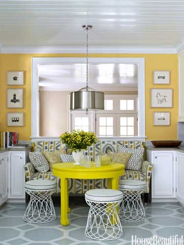
Yellow is the first color the eye sees. Yellow and gray are a favorite color combination. Gray provides the neutral to the intense yellow of this room. I love the bright golden yellow on the walls in contrast to the acid yellow lacquer on the table.

image


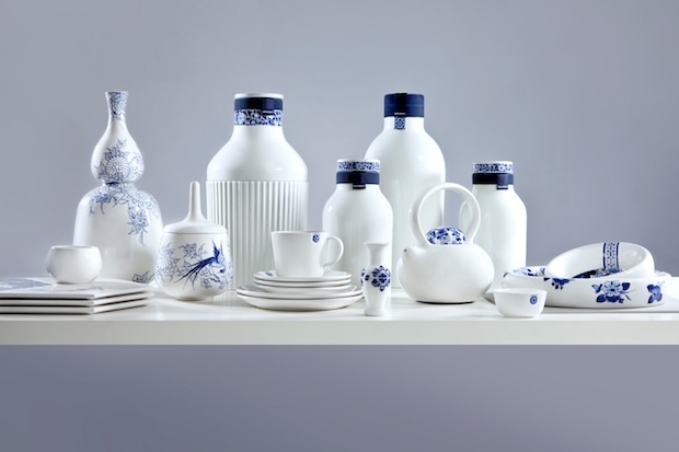
I love this softness of this kitchen. The soft creamy yellow of the tile and cabinets, accented with blue and white. This is a classic use of yellow, blue and white. Yellow increases concentration.

image


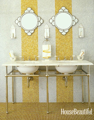
Yellow represents happiness and high energy. I think I would be happy if I had this bathroom. Sophisticated and playful.

image


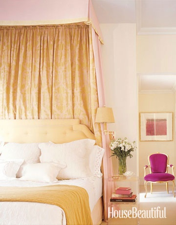
How cool is this color combo? Soft lemony yellow accented with a vivid magenta. Yellow is exciting and magenta, which is part of the pink family brings a joyful and youthful edge to a traditional design.

Color can transform amy interior whether – traditional, modern, french country, formal or casual.

Do not use yellow if you are feeling nervous or don’t want to be noticed.

My Blue Obsession

I recently was reading a stack of older magazines and I noticed a cover of House Beautiful 2010 featured the color blue. The entire magazine is dedicated to various shades of blue – indigo, navy, robin’s egg, green blue etc. I was surprised the blue decorating trend is celebrating fourth year of popularity. I can’t really think of anything or anyone that has universal appeal, okay maybe the Royal family.

So I have been wondering about this trend for some a while. Believe it or not, I do have other things to think about, besides the color blue.  Trend of blue fascinates me, or the longevity of the trend. While I was at a lunch event on branding. The presenter, Catherine Hatcher, President of Personas Image Dynamics, demonstrated the power of color in presentations, brands etc.  and how the color you wear to meeting can influence the tone. The color blue in the only color the has world wide appeal, 85% of people like the color blue.

This is why the color blue is a mainstay in interiors and continues to be a color focus.  Blue is like a good friend, comforting, appealing easy to be around.

Here is a close up of the tile and the light fixtures. the inside of the light fixture is painted blue.

Here is a close up of the tile and the light fixtures. the inside of the light fixture is painted blue.

The color navy blue conveys trust, responsibility, credibility and truthfulness.  White signals refinement and purity. White is also the color of genuineness, innocence and youthfulness.

The color navy blue conveys trust, responsibility, credibility and truthfulness.
White signals refinement and purity. White is also the color of genuineness, innocence and youthfulness.


I think this one of the most beautiful kitchens published. Look closely and many shades of blue appear. the cabinets a blue gray, back splash tile a subtle blue-green and the it of brass make it shimmer.  Blue green mixtures have different meanings. A blue with more green like aqua conveys prestige, high ideals and attracts attention.  Turquoise, which has more blue than green suggests high powered and youthfulness.

I think this one of the most beautiful kitchens published. Look closely and many shades of blue appear. the cabinets a blue gray, back splash tile a subtle blue-green and the it of brass make it shimmer. Blue green mixtures have different meanings. A blue with more green like aqua conveys prestige, high ideals and attracts attention. Turquoise, which has more blue than green suggests high powered and youthfulness.


A bright true blue signifies sincerity and truth, also friendly and approachable. This room mixes a playful palm pattern. I love palm patterned fabric and wallcoverings. The color green adds a pleasant and refreshing element.  The color green denotes peacefulness, balance friendly and candid. A dark green implies wealth and tradition. The pop of red adds energy to the space. Red is passionate, angry, provocative and  memorable.

A bright true blue signifies sincerity and truth, also friendly and approachable. This room mixes a playful palm pattern. I love palm patterned fabric and wallcoverings. The color green adds a pleasant and refreshing element. The color green denotes peacefulness, balance friendly and candid. A dark green implies wealth and tradition. The pop of red adds energy to the space. Red is passionate, angry, provocative and memorable.


The images are from House Beautiful’s website and the color descriptions are from Catherine Hatcher’s color guide.


Behind the Photo Shoot!

I love this post from one of my favorite bloggers, Julia from Hooked on Houses. She is my design kindred spirit. I have to reblog her latest posting on home that was featured in Better Homes and Gardens. Magazine readers haven’t clue how long and what it takes to do a photo shoot. I shoot can take hours to set up, but before the shoot you have to shop for accessories, furniture and fresh flowers. I love photo shoots but they are time consuming, but very fun.

You can find the article at:

http://www.hookedonhouses.net/2014/08/25/styling-a-colorful-ranch-for-better-homes-gardens

I hope this link works, I am technologically challenged at times.


Thinking Small

The August edition of House Beautiful arrived a while ago, I am behind on my reading. The cover story is about living in small spaces. Obviously I am not the only one thinking about living in reduced square footages. The articles prove you don’t have to give up style and function .

Customize - Bespoke built-ins, storage nooks, and furniture tailored to your exact needs can utilize every available sliver of space. Design by Brockschmidt & Coleman

Customize – Bespoke built-ins, storage nooks, and furniture tailored to your exact needs can utilize every available sliver of space.
Design by Brockschmidt & Coleman

Use bigger - fewer things. It may seem counterintuitive, but outfitting a small space with just a few large-scale pieces (rather than a mishmash of pint-size furniture) can actually make it feel grander. That said, don't be afraid of filling up the space. When a room is populated with furniture, it actually appears larger. Designed by Mona Hajj

Use bigger – fewer things.
It may seem counterintuitive, but outfitting a small space with just a few large-scale pieces (rather than a mishmash of pint-size furniture) can actually make it feel grander. That said, don’t be afraid of filling up the space. When a room is populated with furniture, it actually appears larger.
Designed by Mona Hajj


Choose furnishings and decorative elements that offer maximum functionality in minimal square footage. "Use two small round tables instead of one big coffee table," designer Ken Fulk says. "They're better for traffic flow than one of those huge knee knockers, and easier to move." Designed by Ken Fulk

Choose furnishings and decorative elements that offer maximum functionality in minimal square footage. “Use two small round tables instead of one big coffee table,” designer Ken Fulk says. “They’re better for traffic flow than one of those huge knee knockers, and easier to move.”
Designed by Ken Fulk


Think Vertically - Exploit the often under-utilized space between the tops of furniture and a room's ceiling with hanging or high-mounted elements. They'll draw the eye upward. Take bookcases and cabinets all the way up. Designed by Summer Thorton

Think Vertically – Exploit the often under-utilized space between the tops of furniture and a room’s ceiling with hanging or high-mounted elements. They’ll draw the eye upward. Take bookcases and cabinets all the way up.
Designed by Summer Thorton


The articles demonstrate how to live large in small spaces. Some where apartments and others where diminutive homes. I am posting some great ideas from House Beautiful’s website.

50 Shades of Blue – Part II

It’s my favorite time, when the new  shipment of home design magazines. Every magazine this month features blue.  As my readers know I have an affinity for blue – turquoise, cerulean, indigo, navy, robin’s egg and the lists goes on.

Horchow mail order catalogue has a four page spread in Traditional Home this month featuring blue and white, mainly a crisp navy and white interiors, but the last page of the ad features a mainly white interior with art accents of a water blue with warm golden honey wood tones.  Blue and white is a mainstay for any room, any design style and any budget. I also think Asian design, especially Japanese and Chinese pottery and wood pieces work with any style. The key to a successful room design is scale, proportion and balance.

Blue is ingrained in every culture.  We see it woven into beautiful textiles of India and Middle East, the delicate porcelians of Japan and Chinese cultures, as well as the textiles and pottery of the Mediterranean cultures.  As I am writing this I think my next blog topic will be more in depth writing of usage of blue in various colors. Back to our previous subject the Blue and white interiors in this month’s home design magazine.

The chairs in this photo are beautiful. I love the warm brass nailhead detail. Nailhead is great way to dress up an solid upholstery piece. The room is doesn't look staid because the dishes and the linens have lots of pattern and movement. the warm orangish wood floor grounds the room.

The chairs in this photo are beautiful. I love the warm brass nailhead detail. Nailhead is great way to dress up an solid upholstery piece. The room is doesn’t look staid because the dishes and the linens have lots of pattern and movement. the warm orangish wood floor grounds the room.

This image and the one above are from the Horchow Collection named Coast Modern. The ad features my favorite colors blue and white, but as you see vivid green tropical plants add a bunch of color. It is okay to mix woods. This room has a warm light wood coffee table and the chairs have a dark wood frame. It works because of the contrast. Notice the contrast of primitive pattern indigo and white  throw pillows in formal setting.

This image and the one above are from the Horchow Collection named Coast Modern. The ad features my favorite colors blue and white, but as you see vivid green tropical plants add a bunch of color. It is okay to mix woods. This room has a warm light wood coffee table and the chairs have a dark wood frame. It works because of the contrast. Notice the contrast of primitive pattern indigo and white throw pillows in formal setting.

I love the simplicity of this room. Blue and white being the mainstay with honey toned accent in the wicker and flooring. The design element pattern, makes this room interesting. It uses stripes, greek keys, scrolls, circles and squares.

I love the simplicity of this room. Blue and white being the mainstay with honey toned accent in the wicker and flooring. The design element pattern, makes this room interesting. It uses stripes, greek keys, scrolls, circles and squares.

I love this room! Blue and white doesn't have to be bold like the previous photos.  It is simply used in the beautiful watercolors artwork accented with the watm tones of the gold mirror and soft orange of the shell.

I love this room! Blue and white doesn’t have to be bold like the previous photos. It is simply used in the beautiful watercolors artwork accented with the watm tones of the gold mirror and soft orange of the shell.

Pantone color of 2014

This is one of my favorite times of the year. Of course we have the holidays and the ability to spend time with family and friend, but my secret passion is the announcement of Pantone’s color of the year. This year it is Radiant Orchid.

This color will show up in fashion, electronics and of course interior design. This freaks people out because they are thinking I don’t have any purple, lavender or radiant orchid in my house. Like all trends you nay introduce into your life as scarf or handbag to update your wardrobe or your may get an iphone color.  The color for 2013 was emerald green. I now own a shell top I wear all the time and earring and necklaces with emerald green touches.

I have complied photos from Better Homes and Garden, HGTV and One Kings Lane websites so my readers can be inspired by the color for 2014.  Check out HGTV’s website and search Pantone Color of the Year.The images range from an entirely purple room to subtle uses for the Radiant Orchid and Emerald Green.

Here it is - Radiant Orchid Such a happy color.

Here it is – Radiant Orchid
Such a happy color.

What a great addition to spring and summer wardrobe.

What a great addition to spring and summer wardrobe.

I found this photo on the HGTV website.

I found this photo on the HGTV website.

This is a great chair from Wisteria. This would look great with navy, creams and whites.

This is a great chair from Wisteria. This would look great with navy, creams and whites.

Check out HGTV's website, Pantone Color of the year.  It shows some fabulous and not scary ways to use the fresh radiant color.

Check out HGTV’s website, Pantone Color of the year.
It shows some fabulous and not scary ways to use the fresh radiant color.