Early Mother’s Day. I may have peed a little the first time I watched this.
2015 – Year of the Transformation Part II
One of the things I love about writing this blog is connection with others. I have connected with people from all over the world. Some of the blogs I follow aren’t about design, decorating but finances, funny stories, story telling or just sharing tales of life.
I look forward to meeting more people in 2015. Over the last three years I have transforming my life. We moved to Texas, I started a branch for a company that I worked for in St. Louis which has ups and downs, and a rocky foundation. So in to order to fill the time and make new friends I hung out my shingle for a small interior design residential business. Over the last few months it has grown and that is very exciting. I am meeting new people and making new friends and thinking about what life can be for the future.
Check out my new blog/website directionsindesign.wordpress.com Looking forward to a new year.
2015 – The Year of Transformation
It is January of 2015 and I am thinking about my blog theme for the year. Transformation came to mind. I love transforming ordinary spaces into exciting new designs. That is why I chose interior design as a profession. I love visualizing new concepts for any space. The worse the space the more fun the project. Today I have been thinking about what it takes to make changes in a space and in life. It takes a plan, which I find many of my clients don’t put the effort into planning the space. A good plan does not happen overnight, like it does on HGTV. Listed below are a few steps for creating a new space.
Transformation is a process:
Step One: Getting ready
– Admitting the need for change
– How will change improve my life, space
– What do I want to achieve from my new space
– Am I going to try to do this on my own
Step Two: Gathering the information
– As we know all major changes need a team – designer, contactor and a client
– Who will be on my team
– Investment – how much, time and money
Step Three – Now we can begin the design work
– List the design criteria, what are you trying to achieve? this will be the guiding light for the project.
– Gather images and ideas
– Review the images and ideas – will they fit or be suitable for my room. I love a white sofa, but I have three toddlers and a dog, probably not a good fit.
– Create a floor plan to scale, this is where a designer is invaluable
– Create an image board for the furniture and other pieces required for the room.
Step Four – Implement the design
– This is the messy part,
– This is the part when tensions are high and the change is occurring. You want it to happen but it can be chaotic and stressful.
Step Five –
– Now that you made it through all the decisions, craziness of a renovation or room transformation. Enjoy!
– You will think why didn’t I do this sooner.
Design with Heart
As I have mentioned before I love the beginning of the month when the latest issue of my home magazines arrive. The latest Pantone color Marsala, which has gotten flack, but I love it. Marsala is wine color with a hint of gray. That will be another blog posting.
This month the stand out for me is the editor’s page of Architectural Digest. Margaret Russell states “buy what you love.” YES, thank you Margaret. The most memorable homes are the ones that reflect the homeowners life, memories and inividuality. It’s okay to mix it up, modern and traditional, brass and silver, creams and grays, new and old. Ignore the trends and buy what you love. That is my design philosophy. I have a client that has a great style an loves to mix it up. That is makes designing a home fun and exciting, but also creates a unique home.
I recently read an article in the New York Times about the auction of Bunny Mellon’s estate. The writer was stating many of the furnishing were out of fashion. I have a previous posting about Bunny Mellon’s classic style. Her home was beautiful and elegant.
This year I will be encouraging my clients to really think about what they love and go for it.
Have a blessed and Happy New year!!
Mellow Yellow
It is my favorite time of the month, the arrival of new magazines. The October edition of House Beautiful arrived and the featured color is yellow. I couldn’t believe it. For many years I despised the color yellow because my bedroom growing up had yellow antiqued furniture with green patchwork quilts. My mom worked really hard to make a cute little girls bedroom. I hated it because I wanted a purple bedroom. Two of our three girls later and all of them selected purple for their bedrooms, the youngest she wants a orange room.
I researched the web to see if I could find an image of the furniture we had and guess what I found it.
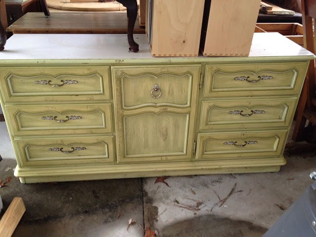

This is dresser and we had a hutch on top. The chest is the furniture my best friend, Missy had in her room. We spent the part of the seventies and early eighties in between the tow bedrooms. listening to music, playing with make up, discussing boys, all things girls do.
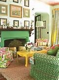
While I was searching I found these images, yellow interiors of the 1970s. This image too a great color and piled it on. Remove the wallpaper and the yellow chest and appliances it could be really playful modern interior. I love the vibrancy of the image on the left. could be an interior of today
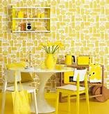
Check this out today or 1970s? I think it is the 1970s because of the wood paneling in the background and the painting in the foreground. Also my fellow blogger at Viva La Vintage scored the two wicker poufs at Goodwill.
Let the Sun shine!
Since attending the workshop on branding and color imaging I have applying the theories to interiors. I love color so the philosophy of color adds another level. I have so many clients ask about what is trending in color. Color is a personal choice, just like your interiors. It’s not about what is the hottest trend it’s about how the hottest trend fits into your home or office. Just because a warm gray is the newest trend for wall color it may not be right for your home. One size does not fit all.
The color I have been thinking about today is yellow. I love yellow. It’s warm, friendly and can be uplifting. I live in Texas so we have 352 days of sunshine. However I have yellow walls in my kitchen and it drives me crazy. They came with the house.
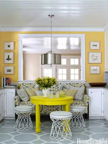
Yellow is the first color the eye sees. Yellow and gray are a favorite color combination. Gray provides the neutral to the intense yellow of this room. I love the bright golden yellow on the walls in contrast to the acid yellow lacquer on the table.

I love this softness of this kitchen. The soft creamy yellow of the tile and cabinets, accented with blue and white. This is a classic use of yellow, blue and white. Yellow increases concentration.
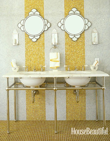
Yellow represents happiness and high energy. I think I would be happy if I had this bathroom. Sophisticated and playful.
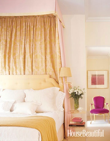
How cool is this color combo? Soft lemony yellow accented with a vivid magenta. Yellow is exciting and magenta, which is part of the pink family brings a joyful and youthful edge to a traditional design.
Color can transform amy interior whether – traditional, modern, french country, formal or casual.
Do not use yellow if you are feeling nervous or don’t want to be noticed.
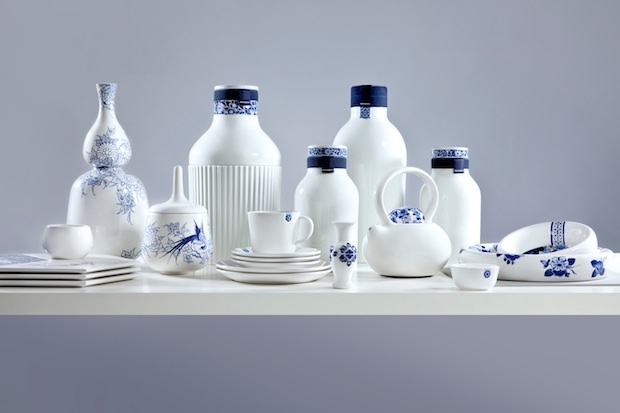
My Blue Obsession
I recently was reading a stack of older magazines and I noticed a cover of House Beautiful 2010 featured the color blue. The entire magazine is dedicated to various shades of blue – indigo, navy, robin’s egg, green blue etc. I was surprised the blue decorating trend is celebrating fourth year of popularity. I can’t really think of anything or anyone that has universal appeal, okay maybe the Royal family.
So I have been wondering about this trend for some a while. Believe it or not, I do have other things to think about, besides the color blue. Trend of blue fascinates me, or the longevity of the trend. While I was at a lunch event on branding. The presenter, Catherine Hatcher, President of Personas Image Dynamics, demonstrated the power of color in presentations, brands etc. and how the color you wear to meeting can influence the tone. The color blue in the only color the has world wide appeal, 85% of people like the color blue.
This is why the color blue is a mainstay in interiors and continues to be a color focus. Blue is like a good friend, comforting, appealing easy to be around.
Here is a close up of the tile and the light fixtures. the inside of the light fixture is painted blue.

The color navy blue conveys trust, responsibility, credibility and truthfulness.
White signals refinement and purity. White is also the color of genuineness, innocence and youthfulness.
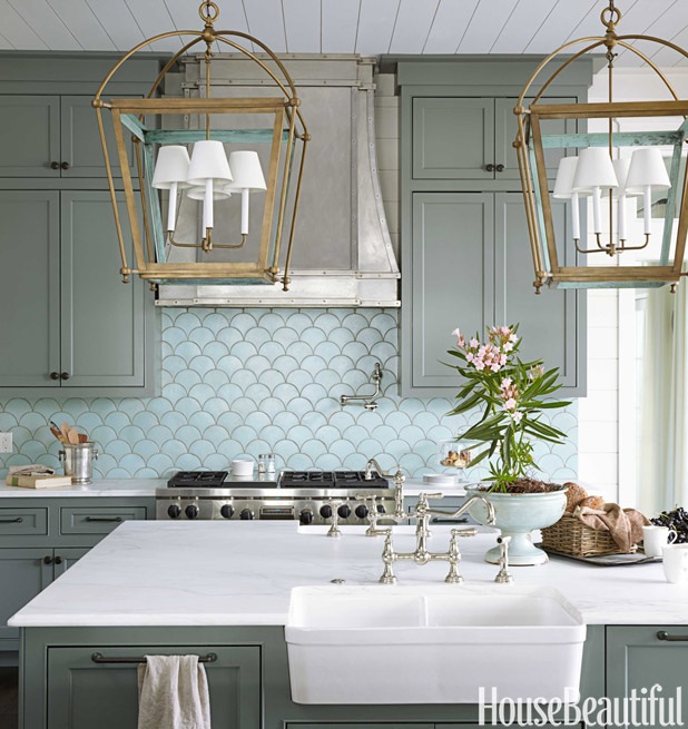
I think this one of the most beautiful kitchens published. Look closely and many shades of blue appear. the cabinets a blue gray, back splash tile a subtle blue-green and the it of brass make it shimmer. Blue green mixtures have different meanings. A blue with more green like aqua conveys prestige, high ideals and attracts attention. Turquoise, which has more blue than green suggests high powered and youthfulness.
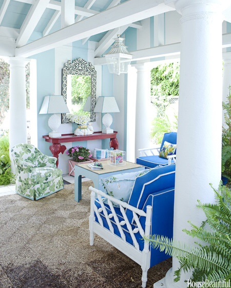
A bright true blue signifies sincerity and truth, also friendly and approachable. This room mixes a playful palm pattern. I love palm patterned fabric and wallcoverings. The color green adds a pleasant and refreshing element. The color green denotes peacefulness, balance friendly and candid. A dark green implies wealth and tradition. The pop of red adds energy to the space. Red is passionate, angry, provocative and memorable.
The images are from House Beautiful’s website and the color descriptions are from Catherine Hatcher’s color guide.
Itty Bitty in the City or Country
Behind the Photo Shoot!
I love this post from one of my favorite bloggers, Julia from Hooked on Houses. She is my design kindred spirit. I have to reblog her latest posting on home that was featured in Better Homes and Gardens. Magazine readers haven’t clue how long and what it takes to do a photo shoot. I shoot can take hours to set up, but before the shoot you have to shop for accessories, furniture and fresh flowers. I love photo shoots but they are time consuming, but very fun.
You can find the article at:
http://www.hookedonhouses.net/2014/08/25/styling-a-colorful-ranch-for-better-homes-gardens
I hope this link works, I am technologically challenged at times.
Pillow Talk
Okay, I am obsessed with old romantic comedies from the 1960’s, mainly Doris Day’s movies. Doris Day epitomizes glamour and classical style. The interior design and clothing design for her movies are timeless. The movies and TV shows I watched as a kid have shaped my interior design love and style.
Doris Day 1960’s romantic comedy movies are my version of a Dylan’s Candy Bar, the candy store in New York City. I love them – they are colorful, uplifting and visually stimulating. if watch to many of them you will get a sugar hangover. It is worth the indulgence, of course in moderation.
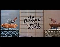
Pillow Talk is one of my favorite movies. Love Doris’ apartment. The movie is about Doris Day and Rock Hudson sharing a telephone line called a party line. Arguments arise when Rock Hudson hogs the party line to woo his girl friends.
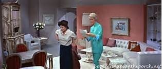
In this scene Doris is talking with her housekeeper in the living room. I would wear her pajamas. love the pink walls and white furniture. I envisioned my grown up apartment to look like this, but as you know I love blue and white. Doris and her maid Alma are discussing Rock Hudson conversations.
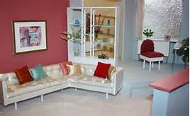
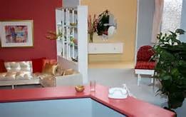
The image above is a photo of the set, the image below is also a photo of the set.
Check out more movie homes at one of my favorite blogs hookedonhouses.net
